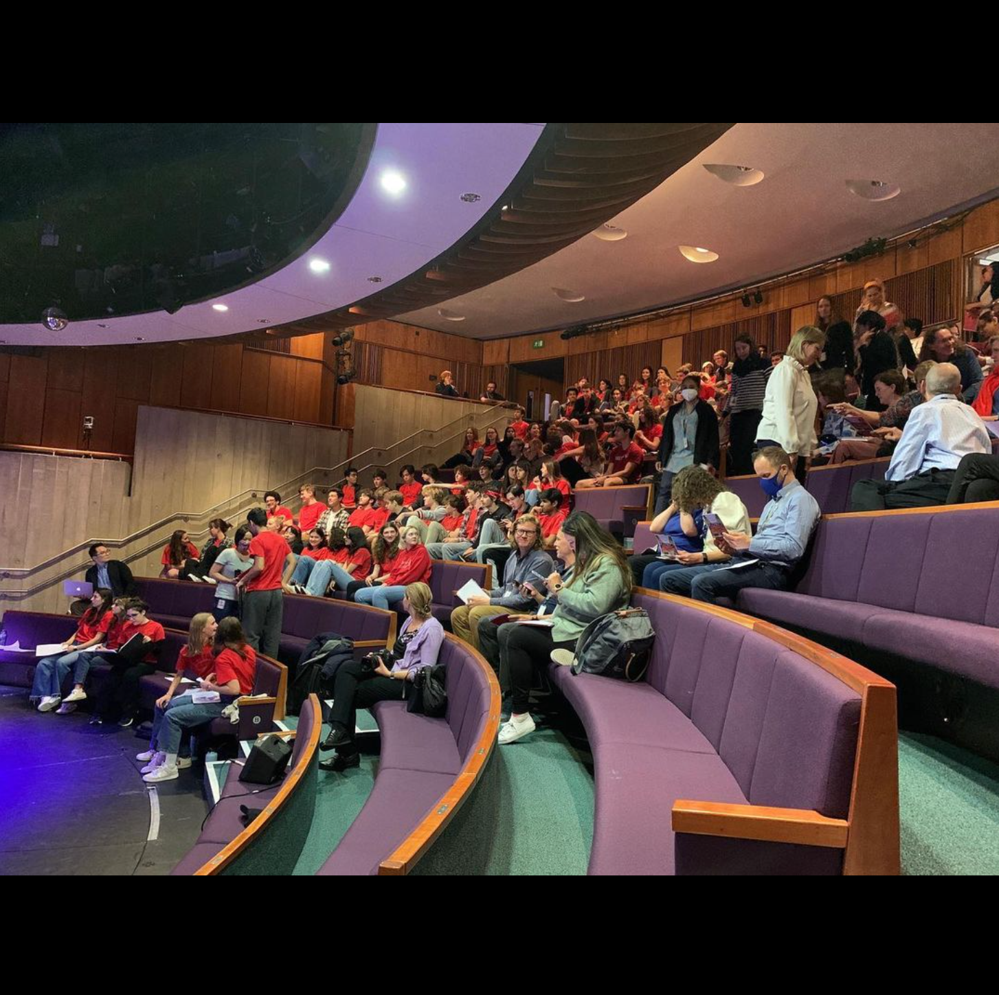
During a class period, the editors and I make edits on initial pages of our fourth issue April 22, 2024.
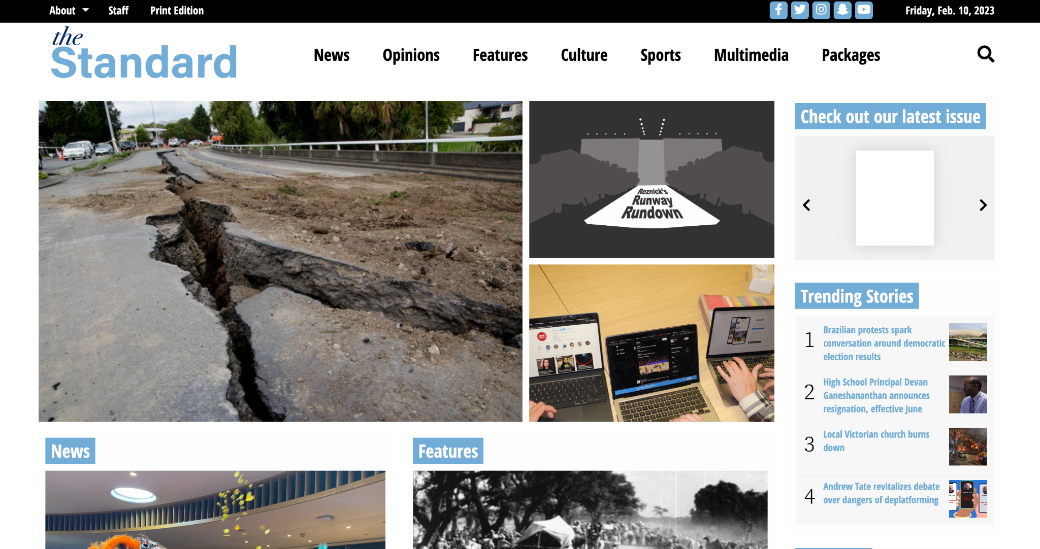
When I took on my role, I realized that while our site had evolved visually over the years, its core functionality had remained unchanged. Inspired by the online presence of several college newspapers like The Michigan Daily and The Dartmouth, I set out to overhaul several aspects of our site. My goal was to enhance accessibility and improve the flow of information, creating a more intuitive experience for our readers. Specifically, I changed and focused on:
These design changes not only modernized the look but also made it easier for our audience to find and interact with content — a critical goal for audience engagement and long-term growth.

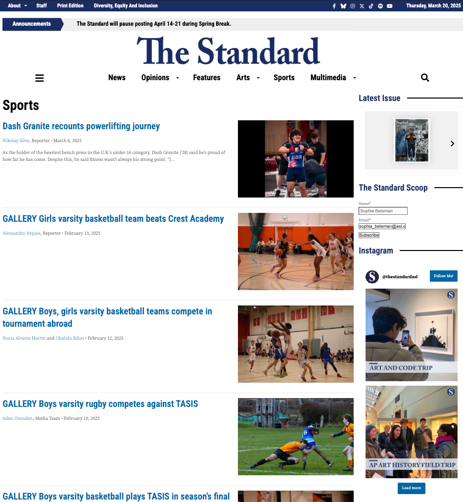
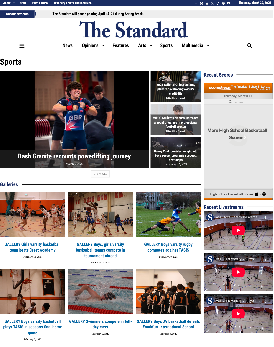
I also created a custom layout for our sports section, which we had never done before. This way, readers can more easily find what they're looking for — a written article, photo gallery, game scores or a livestream. View the new sports page here.
Along with the website redesign, I assisted the Deputy Editor-in-Chief: Online with a redesign of The Standard's app over the summer. The app serves as one of the primary ways community members stay informed about our online stories. The design changes we made are noted below.
Watch the video here for an overview of what our app now looks like.
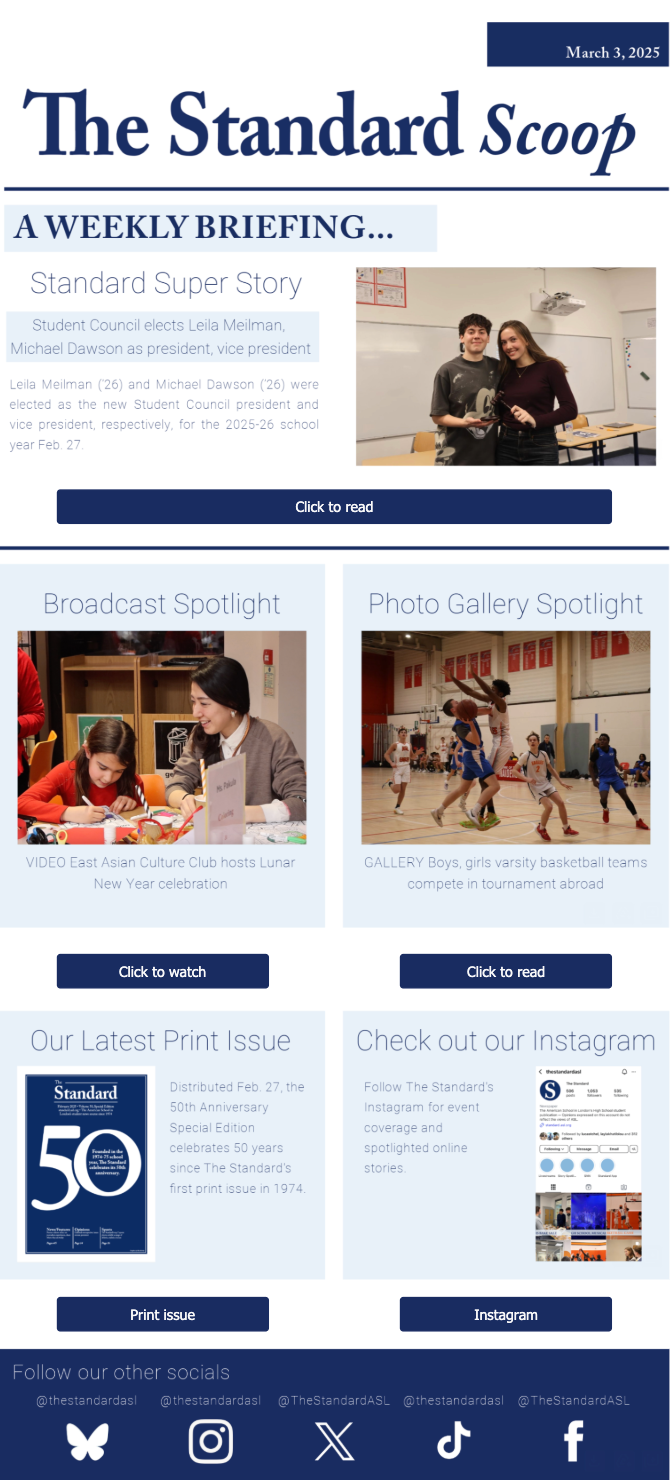
I designed the newsletter below — a new addition to The Standard this year — in collaboration with the Social Media Editor. We used The Standard’s official color palette for visual consistency and divided the layout into clear content blocks to enhance readability and eye flow. Each section maintains alignment and balance, with consistent font styles, button placement and image sizing, while contrast between text and background ensures clarity. The structured design helps guide the reader naturally from one element to the next, making the newsletter easy to navigate and visually cohesive. To learn more about the newsletter, visit the Marketing and Audience Engagement section.
This year, the Social Media Editor and I collaborated to redesign our Instagram template, which has evolved through several versions over recent years. We aimed for a minimalist, cohesive look, featuring just the event title and a small logo in the top right corner. Previous designs either felt cluttered or lacked visual interest, so we focused on striking the right balance.
Below are the designs from the last few years.
The header of our Facebook and X accounts was long overdue for a redesign. Not only had the names of core sections on our website changed, but our font had also shifted. I created a new design with the same essence to maintain consistency across social media platforms. I also utilized this header design on our new Bluesky account.
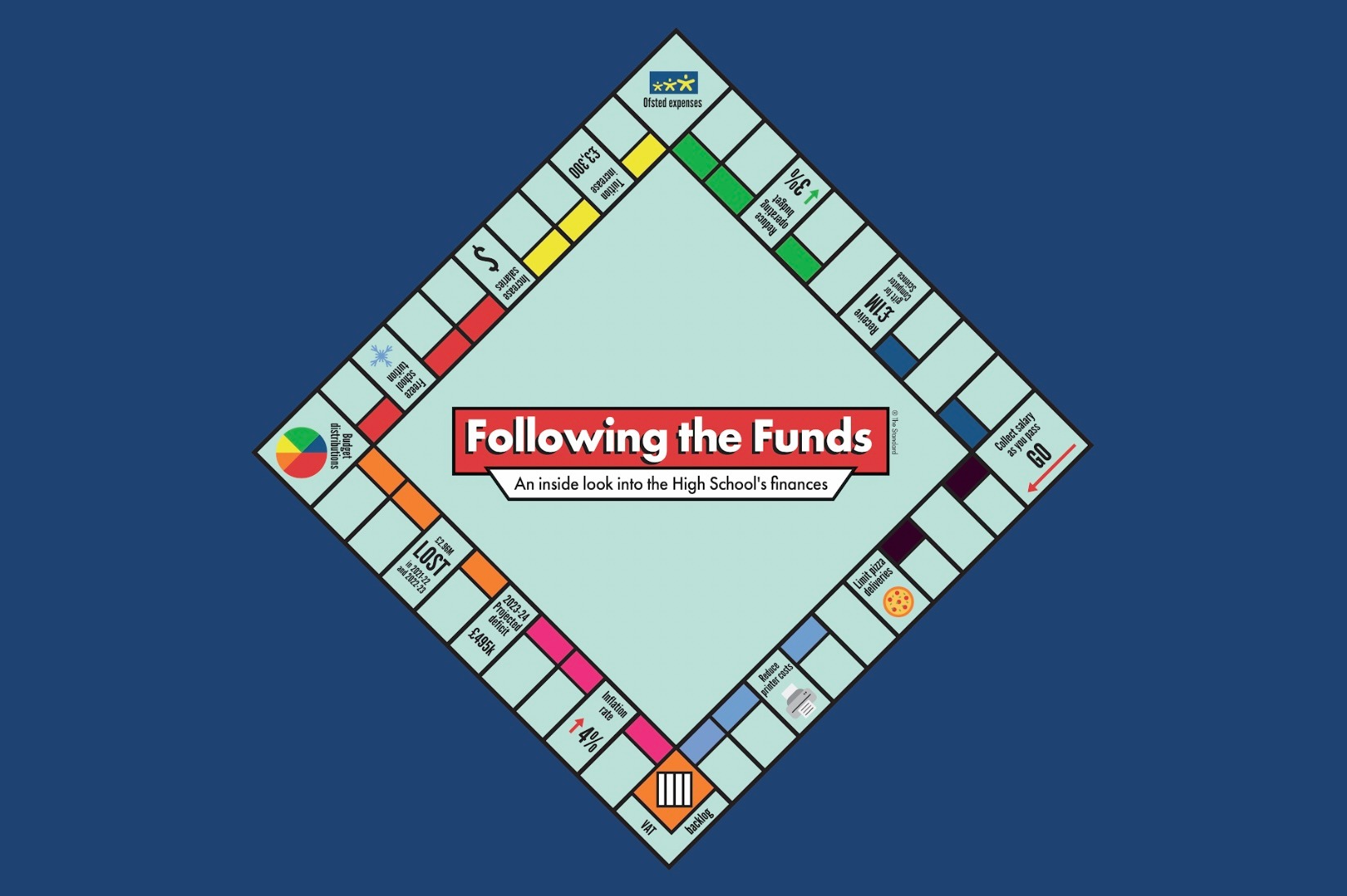
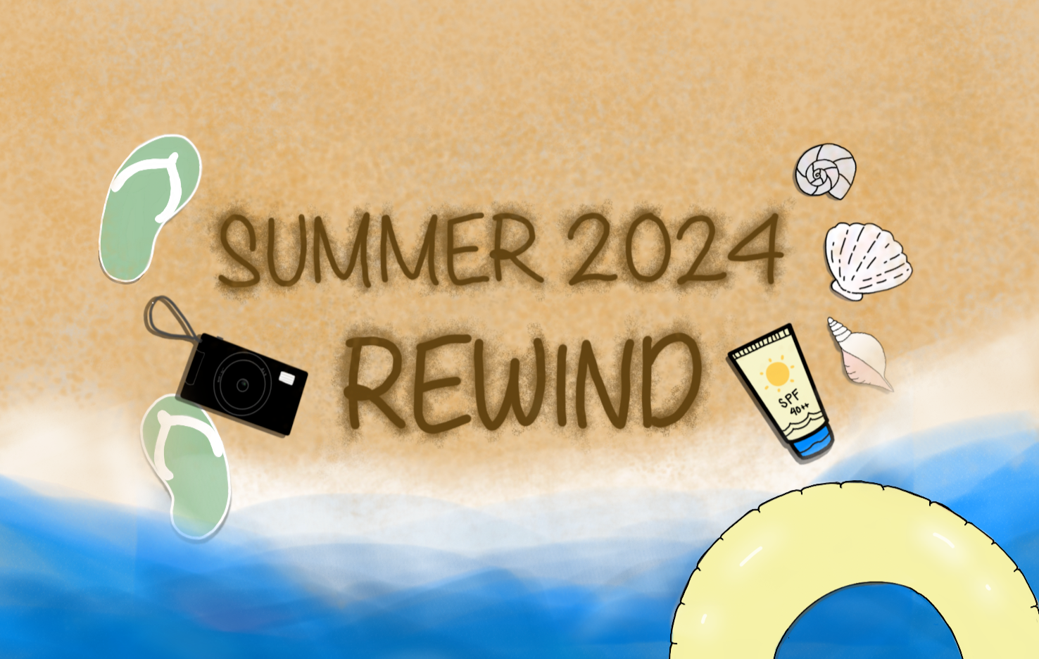
The two stories below are long-form ones I have written. Due to their length, I had to split up the text with other elements, including lots of multimedia. Both stories had color themes that I stuck to when creating the elements. Click on each image below to see the designs I created.
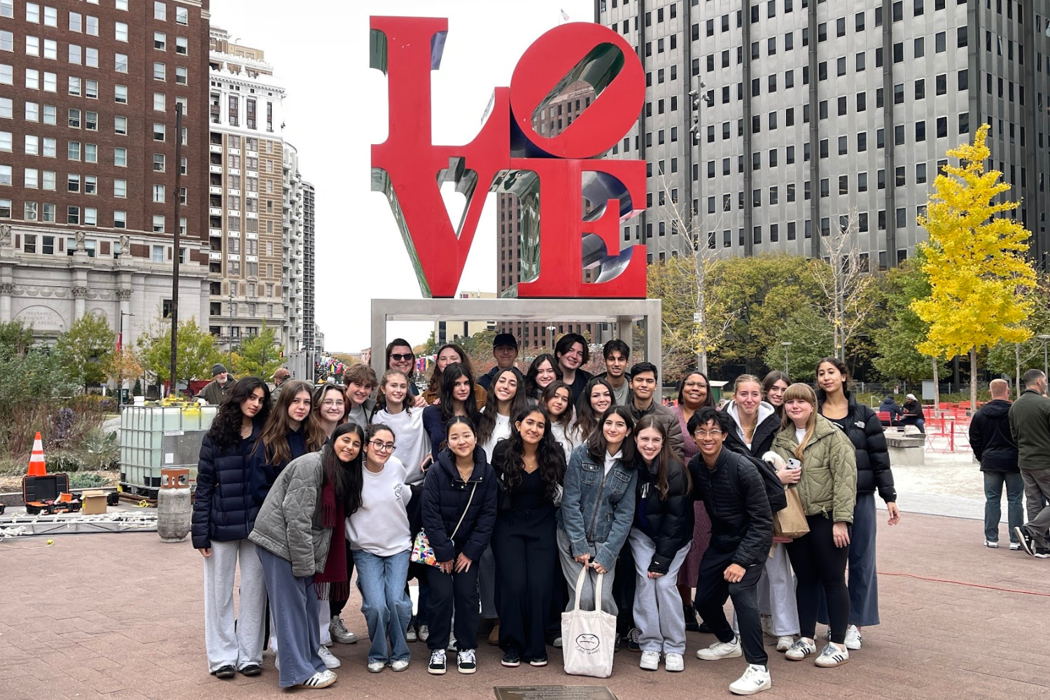
In addition, I have spearheaded the creation of three online packages in my tenure as Editor-in-Chief: Online. The two online packages below are the best examples of my web design. Not only did I design the grid they are organized in, but I also formatted each individual story, ensuring each had some other element such as multimedia.
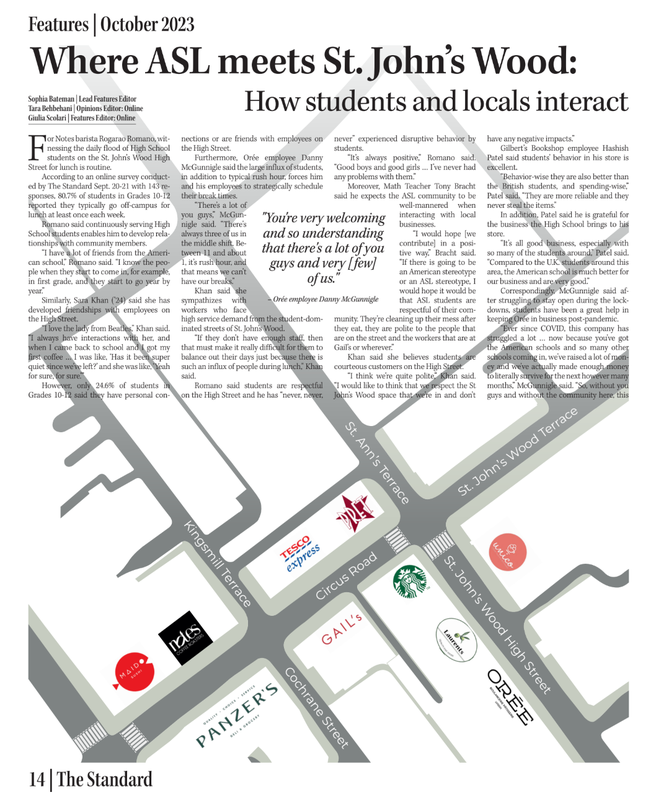
Although my role as Editor-in-Chief: Online no longer includes formal responsibilities for print, I’ve still made time to design a page or two this year. Previously, as Lead Features Editor during the 2023–24 school year, I was responsible for both print and online content, regularly laying out at least two pages for about five issues. Below are a few of my favorite designs from that time, which reflect my attention to visual storytelling and page aesthetics. Click on each one to be taken to the PDF version of the story.
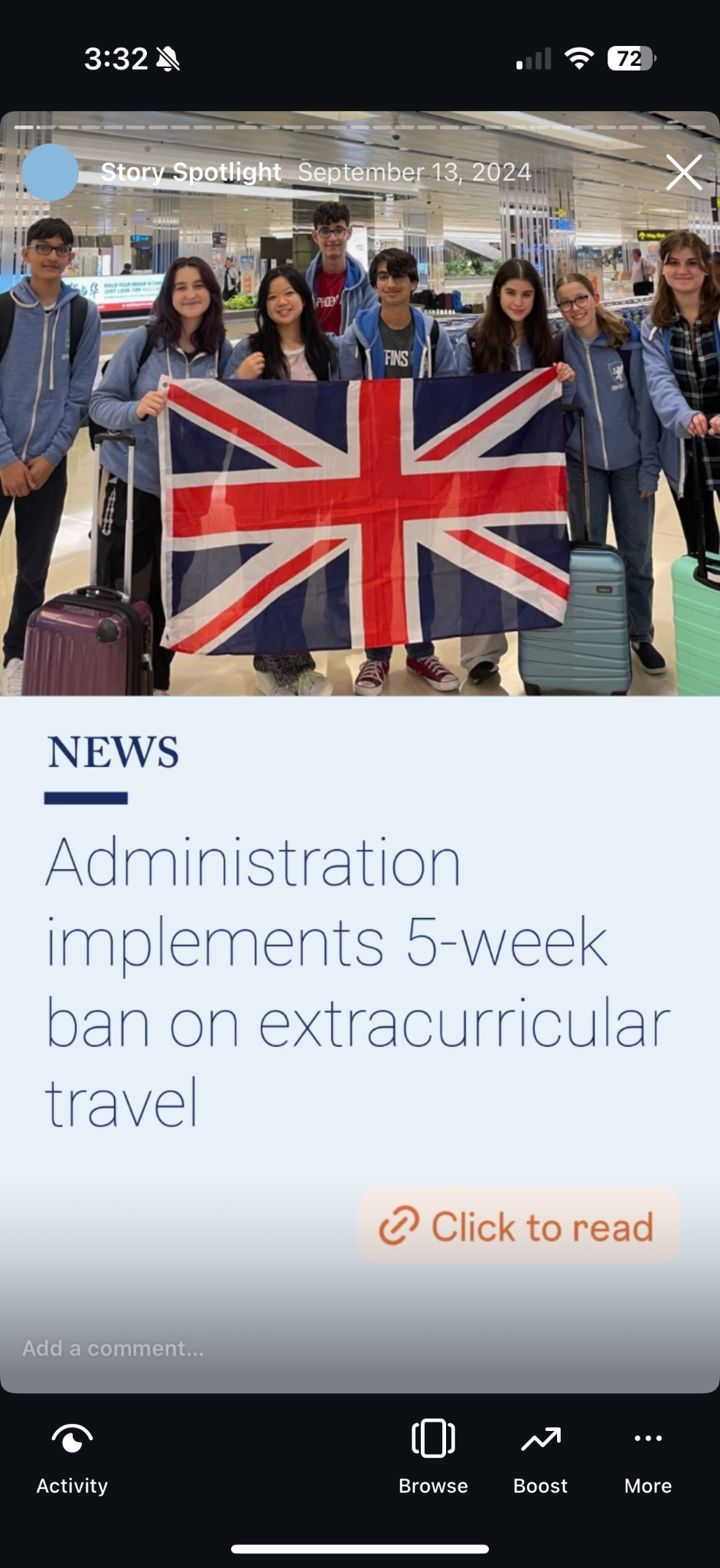
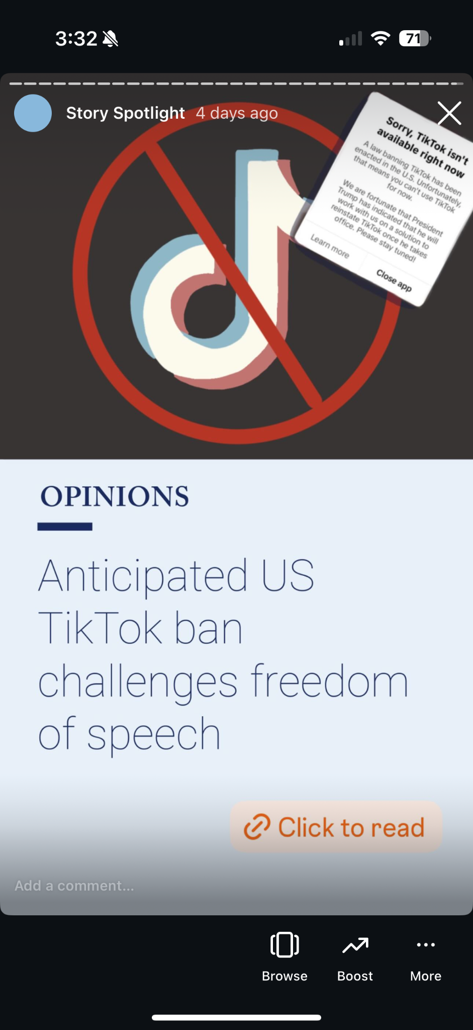
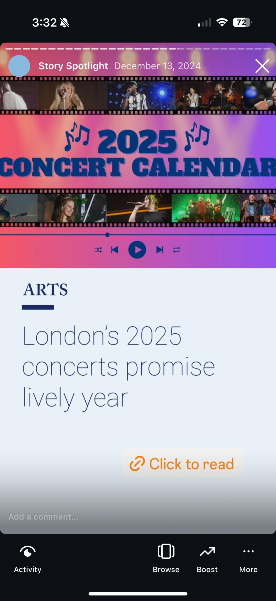
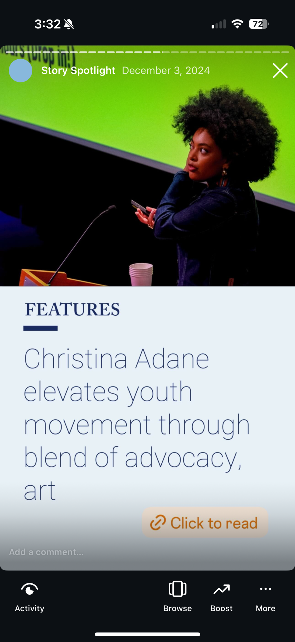
This year, I co-designed the template for the new Story Spotlights feature with the Social Media Editor. In designing these, I focused on: